
Designing a Responsive Navigation Bar with HTML, CSS, and JavaScript: A Step-by-Step Guide

Creating a responsive navigation bar is a crucial skill for web developers. A well-designed navigation bar improves user experience by allowing easy access to different sections of a website, regardless of the device being used. In this guide, we'll build a simple yet effective responsive navigation bar using HTML, CSS, and JavaScript.
What is a Responsive Navigation Bar?
A responsive navigation bar adjusts its layout and functionality based on the screen size. On larger screens, navigation links are typically spread horizontally. On smaller screens, they collapse into a menu icon (commonly known as a hamburger menu), making the design more compact and user-friendly.
Step 1: Basic HTML Structure
Let’s begin by setting up the HTML structure for the navigation bar. We'll define a container for the navigation links and a button that will be used to toggle the navigation menu on smaller screens.
<!DOCTYPE html>
<html lang="en">
<head>
  <meta charset="UTF-8">
  <meta name="viewport" content="width=device-width, initial-scale=1.0">
  <title>Responsive Navigation Bar</title>
  <link rel="stylesheet" href="styles.css">
</head>
<body>
  <header>
    <nav class="navbar">
      <div class="logo">MyWebsite</div>
      <ul class="nav-links">
        <li><a href="#">Home</a></li>
        <li><a href="#">About</a></li>
        <li><a href="#">Services</a></li>
        <li><a href="#">Contact</a></li>
      </ul>
      <button class="hamburger" id="hamburger">
        <span class="bar"></span>
        <span class="bar"></span>
        <span class="bar"></span>
      </button>
    </nav>
  </header>

  <script src="script.js"></script>
</body>
</html>
In this code:
- The
<nav>element holds the navigation links. - The
<ul>contains the individual navigation items (<li>), each linking to a different section of the site. - The
hamburgerbutton will be used to toggle the menu in the mobile view.
Step 2: Styling the Navigation Bar with CSS
Now, we’ll add some basic CSS to style the navigation bar and make it look modern. This includes designing the layout for both desktop and mobile screens.
/* Basic reset */
* {
  margin: 0;
  padding: 0;
  box-sizing: border-box;
}

body {
  font-family: Arial, sans-serif;
}

/* Navigation Bar Styling */
.navbar {
  display: flex;
  justify-content: space-between;
  align-items: center;
  background-color: #333;
  padding: 10px;
}

.navbar .logo {
  color: #fff;
  font-size: 24px;
  font-weight: bold;
}

.nav-links {
  display: flex;
  list-style: none;
}

.nav-links li {
  margin-left: 20px;
}

.nav-links a {
  color: white;
  text-decoration: none;
  font-size: 18px;
}

.nav-links a:hover {
  color: #f0a500;
}

/* Hamburger menu */
.hamburger {
  display: none;
  flex-direction: column;
  cursor: pointer;
}

.hamburger .bar {
  height: 3px;
  width: 25px;
  background-color: white;
  margin: 4px 0;
}

/* Responsive Styles */
@media (max-width: 768px) {
  .nav-links {
    display: none;
    position: absolute;
    top: 60px;
    right: 0;
    width: 100%;
    flex-direction: column;
    background-color: #333;
  }

  .nav-links li {
    text-align: center;
    margin: 15px 0;
  }

  .hamburger {
    display: flex;
  }
}
Here’s what’s happening:
- Basic Layout: We use Flexbox to align the logo and the navigation links. The
.navbarflex container ensures that items are aligned properly and spaced apart. - Hover Effect: When the user hovers over the navigation links, the color changes.
- Responsive Design: When the screen width is 768px or smaller, the
.hamburgerbutton becomes visible, and the links in.nav-linksare hidden. We also define that the links will be displayed vertically when visible.
Step 3: Adding Interactivity with JavaScript
To make the hamburger menu functional, we need to add a simple JavaScript toggle that will show or hide the navigation links when the button is clicked.
// Selecting the hamburger button and nav-links
const hamburger = document.getElementById('hamburger');
const navLinks = document.querySelector('.nav-links');

// Toggle the display of the nav-links when hamburger is clicked
hamburger.addEventListener('click', () => {
  navLinks.classList.toggle('show');
});
In the JavaScript code:
- We select the hamburger button and the navigation links using
document.getElementByIdanddocument.querySelector. - We add an event listener to the hamburger button that toggles the
showclass on the.nav-links. This class controls whether the links are visible or hidden in mobile view.
Next, update the CSS to handle the show class.
/* Show nav-links when clicked in mobile view */
.nav-links.show {
  display: flex;
}
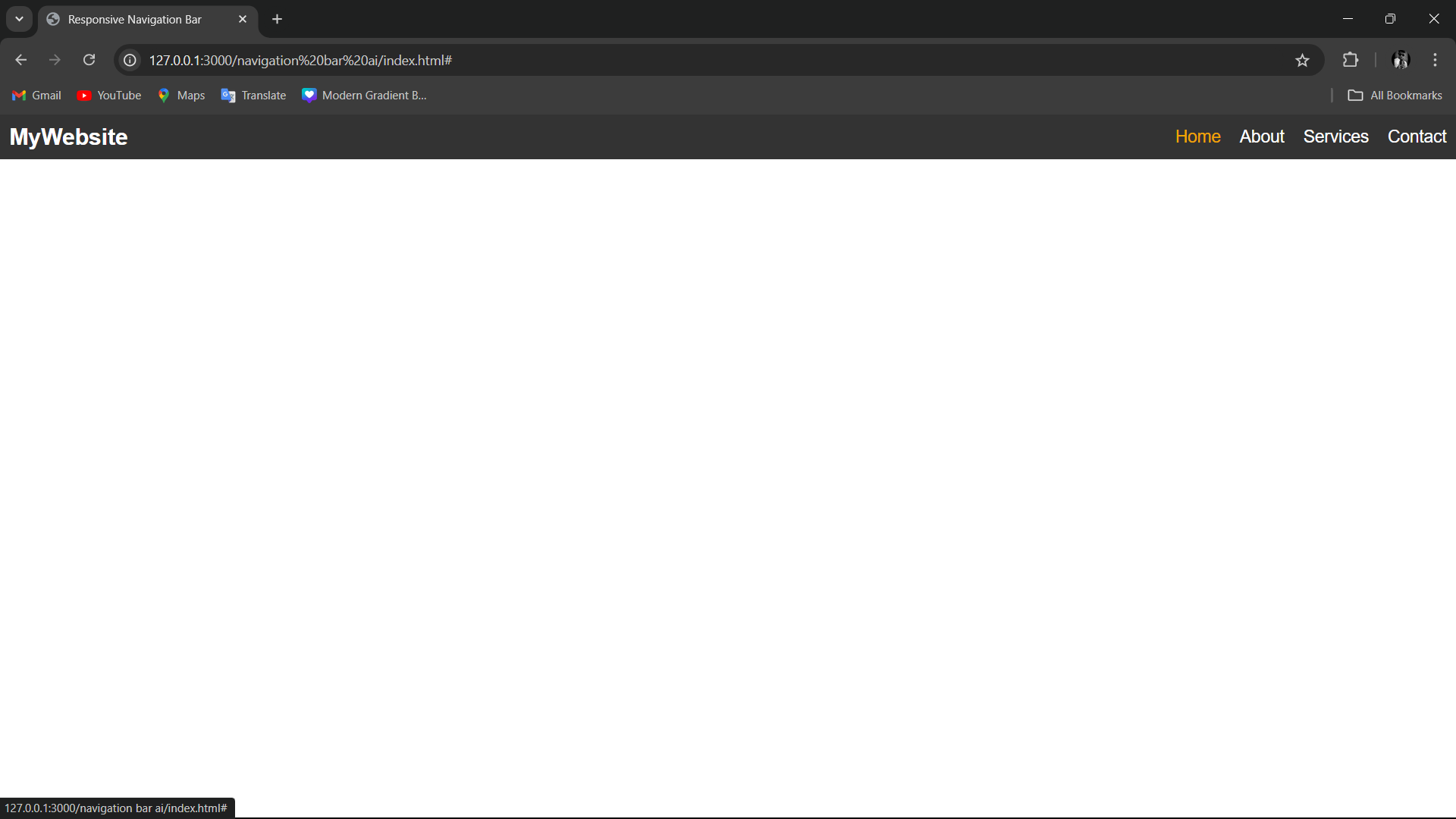
Step 4: Testing the Navigation Bar
Your navigation bar is now responsive and functional! Test it by resizing your browser window or opening the page on a mobile device. On larger screens, the links will be displayed horizontally. On smaller screens, the hamburger icon will appear, and clicking it will display the links in a vertical list.
The Final result :
Conclusion
With just a few lines of HTML, CSS, and JavaScript, you can create a responsive navigation bar that looks great on any device. This is just a basic example, and you can enhance it further by adding animations, dropdown menus, or more advanced features to suit your website's needs.
By mastering this concept, you'll be able to improve the user experience and functionality of your website, ensuring that visitors can navigate easily whether they’re on a desktop, tablet, or smartphone.
Happy coding!
Author: Aryan Kumar is a web developer specializing in HTML, CSS, and JavaScript, working at Asecurity. Contact here (Instagram) : @aryan_geek .
#webdevelopment #html #css #javascript